Wednesday, November 28, 2007
2010 Olympics Mascots Are Teh Sux0rz
by Jes
The 2010 Winter Olympics here in Vancouver have already cost us BC taxpayers millions upon millions of dollars. Besides throwing away a lot of money to throw a 2-week sporting party for the benefit of corporate asswipes, the real estate market has gone insane, and many people cannot afford more than a postage-sized stamp condo around here.
For all of the $$ we're shelling out, you'd figure we'd at least get a logo that DOESN'T SUCK!
For some time, the 2010 Official Logo has been the Inukshuk, an Inuit statue that is not actually native to BC, and looks like something that would come out of my ass after eating a whole box of stale Froot Loops.

For some reason, The Powers That Be seem to think that any logo that represents BC or Vancouver has to be 'native', despite the fact that about only about 4.3% of Canada's population is 'native'. If we wanted a logo that truly represented this province, it would be an empty Starbucks latte cup, or a generic 20-storie condo. The only thing 'native' in this city is the token totem pole put up for tourists to take photos of.
Yesterday, there was the big unveiling of the new 2010 mascots, and, as expected, they really suck. Instead of using something good, like the Spirit Bear, we get this shit ...
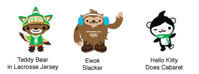
C'mon! These things don't look at all like the animals they are supposed to be. If I had a kid, I certainly wouldn't waste a dime buying him/her anything with one of these 'animals' on it.
Besides being over-the-top cute, the whole design of the mascots just looks childish and far too Japanese. Yes, Japanese. This is Vancouver, not Tokyo, so why not a design that reflects a North American look? It's as if Vancouverites are ashamed to have their own 'real' culture, and have to pilfer ideas from elsewhere.
The Atlanta Spring-thing now has competition for the worst Olympic logo ever. Puke!
The 2010 Winter Olympics here in Vancouver have already cost us BC taxpayers millions upon millions of dollars. Besides throwing away a lot of money to throw a 2-week sporting party for the benefit of corporate asswipes, the real estate market has gone insane, and many people cannot afford more than a postage-sized stamp condo around here.
For all of the $$ we're shelling out, you'd figure we'd at least get a logo that DOESN'T SUCK!
For some time, the 2010 Official Logo has been the Inukshuk, an Inuit statue that is not actually native to BC, and looks like something that would come out of my ass after eating a whole box of stale Froot Loops.
For some reason, The Powers That Be seem to think that any logo that represents BC or Vancouver has to be 'native', despite the fact that about only about 4.3% of Canada's population is 'native'. If we wanted a logo that truly represented this province, it would be an empty Starbucks latte cup, or a generic 20-storie condo. The only thing 'native' in this city is the token totem pole put up for tourists to take photos of.
Yesterday, there was the big unveiling of the new 2010 mascots, and, as expected, they really suck. Instead of using something good, like the Spirit Bear, we get this shit ...
Miga is a mythical First Nations sea bear that is part killer whale and part Kermode spirit bear. Miga was based on the legends of the Pacific Northwest First Nations of orca whales that transform into bears when they arrive on land, but is also a snowboarder.
Quatchi is a sasquatch, but a shy and gentle giant, that loves all winter sports, and is especially fond of hockey and dreams of becoming a world-famous goalie.
The third mascot, Sumi, is an animal-guardian spirit who wears the hat of the orca whale, flies with the wings of the mighty Thunderbird and runs on the furry legs of the black bear.
C'mon! These things don't look at all like the animals they are supposed to be. If I had a kid, I certainly wouldn't waste a dime buying him/her anything with one of these 'animals' on it.
Besides being over-the-top cute, the whole design of the mascots just looks childish and far too Japanese. Yes, Japanese. This is Vancouver, not Tokyo, so why not a design that reflects a North American look? It's as if Vancouverites are ashamed to have their own 'real' culture, and have to pilfer ideas from elsewhere.
The Atlanta Spring-thing now has competition for the worst Olympic logo ever. Puke!
Labels: 2010 Olympics, Olympic Mascots, Olympics, Vancouver Sucks
Comments:
<< Home
Bleah, this is the first I`ve seen of the new mascots. I agree, too cute, too obscure and too Japanese. At first glance, I thought those pics were going to refer back some Asian mascots.
Um... we have a logo that has nothing to do with British Columbia (inukshuks belong up in the Yukon, NWT and Nunavut), so might as well have an art style that has nothing to do with the country too eh? Then again, maybe its a nod to all the Asian communities here. *sigh*
God forbid we have something that looks like it belongs in B.C....
-Aurian
# posted by  : 8:58 am
: 8:58 am
PS - I don`t know why they can`t be bothered to have some voting system for these mascots and logos. They suck. We gotta look at these for the next 3 years, doesn`t the BC Public get some say in this?
Its our money paying for it after all!
Guess not. Some overpaid ad exec knows better and screw making it relevant to the area hosting the damn Olympics.
Its our money paying for it after all!
Guess not. Some overpaid ad exec knows better and screw making it relevant to the area hosting the damn Olympics.
# posted by : 9:05 am
: 9:05 am
Once, just once, I want one of the people who are bitching about the use of native and asian symbols to offer a viable alternative. What symbol of "white" culture would you suggest we use instead? I mean, I know there's three guarantees in life: taxes, death, and Golbez bitching about everything, but has anyone stopped to think that the reason we're always borrowing from other cultures is because we don't have any culture of our own?
And isn't Asian culture (not to suggest that it's monolithic), in a lot ways, Vancouver's culture? If it isn't, what is? Go step outside your office building. How many fucking white people do you see? Vancouver may not be Tokyo, but in many ways it has a lot more in common with Hong Kong than it does with Winnipeg.
And isn't Asian culture (not to suggest that it's monolithic), in a lot ways, Vancouver's culture? If it isn't, what is? Go step outside your office building. How many fucking white people do you see? Vancouver may not be Tokyo, but in many ways it has a lot more in common with Hong Kong than it does with Winnipeg.

Ahh, McLea, my #1 fan. How are you, kind sir? ;)
Yes, I bitch a lot, but you seem to cherry pick to think that all I do is whine and dine.
Canada has many traditions to build from, especially Anglophone (English/UK) and Francophone (Quebecois/France). Calgary did a great job of making their mascots and logo Canadian, and didn't have to pander to the usual 'oooh, Canada = Native' routine that BC days way too often.
If we have to put up with Asian/Native logos, at least make them good! It doesn't matter that the designs used in this logo are from Japan or Madagascar, they are simply and utterly goofy. How anyone can think that they represent Vancouver/BC is beyond me. We need some people to stop putting up with this politically correct bullshit and stop pretending like the 'white' cultures don't exist. It's as if people are afraid that exerting any anglo/franco/slavic/germanic influence in politics or symbols is racist or exclusive.
And, yes, I am well aware of the Asian influence in my city. I am a member of the 'invisible minority', after all.
I just looked up previous mascots of the Summer Games and found out the Vancouver ones are just following the tradition:
Link here
I have trouble associating Korea with tigers, for example.
Link here
I have trouble associating Korea with tigers, for example.
The sasquatch I could see working as a masct, but my main questionis why d they need three mascots and a "sidekick" mascot? It just doesn't make sense to me.
Post a Comment
<< Home
![]()